
|
I get a lot of questions on the Performance Management Chart (PMC) from athletes. Its a popular topic that can get complicated quickly, so thought I would post a short primer that goes over the basics. The PMC and its related terminology was developed originally by Dr. Andy Coggan. TrainingPeaks licenses the concepts and an automated version is built into the TrainingPeaks tool. When looking at the physical/fitness components of training, the most fundamental elements any coach or athlete need to consider in prescribing a training plan are: volume (how much) intensity (how hard) and frequency or recovery (how often) a training “load” is being applied to an athlete. The PMC provides coaches and athletes an objective way to monitor fitness, stress loads and fatigue levels to better manage these factors. Here is a sample chart for reference as we walk through the elements: 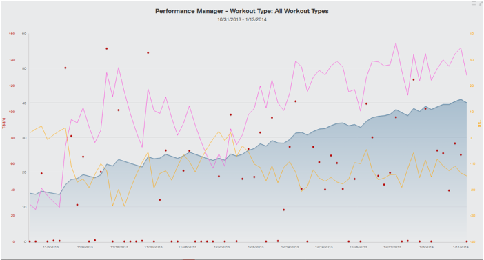 Sample Performance Management Chart The red “dots” are an index of “stress” for individual workouts based on the intensity and duration, called Training Stress Score or TSS. As a baseline, the power, HR or average pace an athlete can hold for 1 hr all out results in a 100 TSS. This is also considered the athlete’s threshold power, HR or pace. TSS for individual workouts are calculated based on the intensity and duration and are the basic data elements for the remaining calculations. A high intensity short workout and a lower intensity longer workout could both trigger a similar training stress score (TSS). A key point here, the more accurate the athlete’s threshold numbers for power, HR and/or pace are, the more useful these charts are in monitoring the athlete’s status.
The pink line is an index measuring the exponential avg amount of TSS the athlete has accumulated during an acute or short 1 week period (ATL for Acute Training Load). It’s also described as “fatigue” or the short term stress that athlete has been subjected to. The blue line is similar, but it’s the exponential avg TSS over a chronic or longer 42 day period (CTL or Chronic Training Load). It’s also described as “fitness” or the long term stress the athlete has been subjected to. The 7 and 42 day periods are defaults that have proven to be good markers based on research. TrainingPeaks actually allows you to change these defaults if you desire, but I have not really found a case where that is necessary. The literature associated with this approach outlines some general ranges for CTL. Personally, I have not found these values to reflect a reasonable load for most working athletes. From my experience, it’s difficult to account for daily work related stress, running around, chasing kids, up early, to bed late etc. I have found that “target” values over a season are individual. I recommend paying the most attention to the slope of CTL (fitness) and how steadily an athlete is progressing over time as stress is added via either volume or intensity or both. TrainingPeaks mobile provides metrics to track these trends as well. The yellow line (Training Stress Balance or TSB) is basically the difference between fitness and fatigue and it correlates to how “tired” or how “fresh” an athlete might be given how much short term and long term stress has accumulated. For example, a 4 hr ride with tempo efforts in it early in the season when an athlete is less fit will likely make the athlete more tired, and require more recovery, than the same ride later in the season when an athlete is more fit and has more “work” under their belt. TSB can be very useful in correlating and even predicting when an athlete is going to feel pretty good or might start feeling tired, drug out an at risk for illness. Like everything, it is a little different for each individual, but in general under a good load, -10 to -20 seems to be about as deep as you want to go for any period of time. Most athletes hitting below -20 generally start seeing some lingering fatigue, feel tired and run higher risk of illness. Start getting into +10 and above and the athlete may feel tired at first as their body starts to shift to recovery mode, but then they usually feel good shortly after that, this is usually where we want to see you after a rest period and going into bigger races. Again the specifics depend on the individual and how accurate their threshold numbers are, but the general trends seem to hold. I can't stress enough that you shouldn't base everything on this chart, just like you would never drive your car using gauges alone. The chart is a great decision support tool, especially for remote coaches who are trying to gain insight into how their athletes are responding to the training plans they are being prescribed. For more info on TSS and the PMC, check out these TrainingPeaks articles: http://home.trainingpeaks.com/blog/article/applying-the-numbers-part-2-training-stress-score https://www.trainingpeaks.com/blog/what-is-the-performance-management-chart/ 12/1/2021 12:13:45 am
I loved your statement that the literature associated with this approach outlines some general ranges for CTL. I love cycling and it makes me healthy and bodily fit. Although I loved it, I don't have the proper training to do it right. I will follow your advice to go into power-based cycling coaching to have the proper knowledge. Thanks for your post.
Otterhaus Coaching
12/8/2021 11:48:24 am
Thanks Jeff! Comments are closed.
|
|
|
|

|
Website Design and Content © 2015-2022 Otterhaus Enterprises LLC, All Rights Reserved